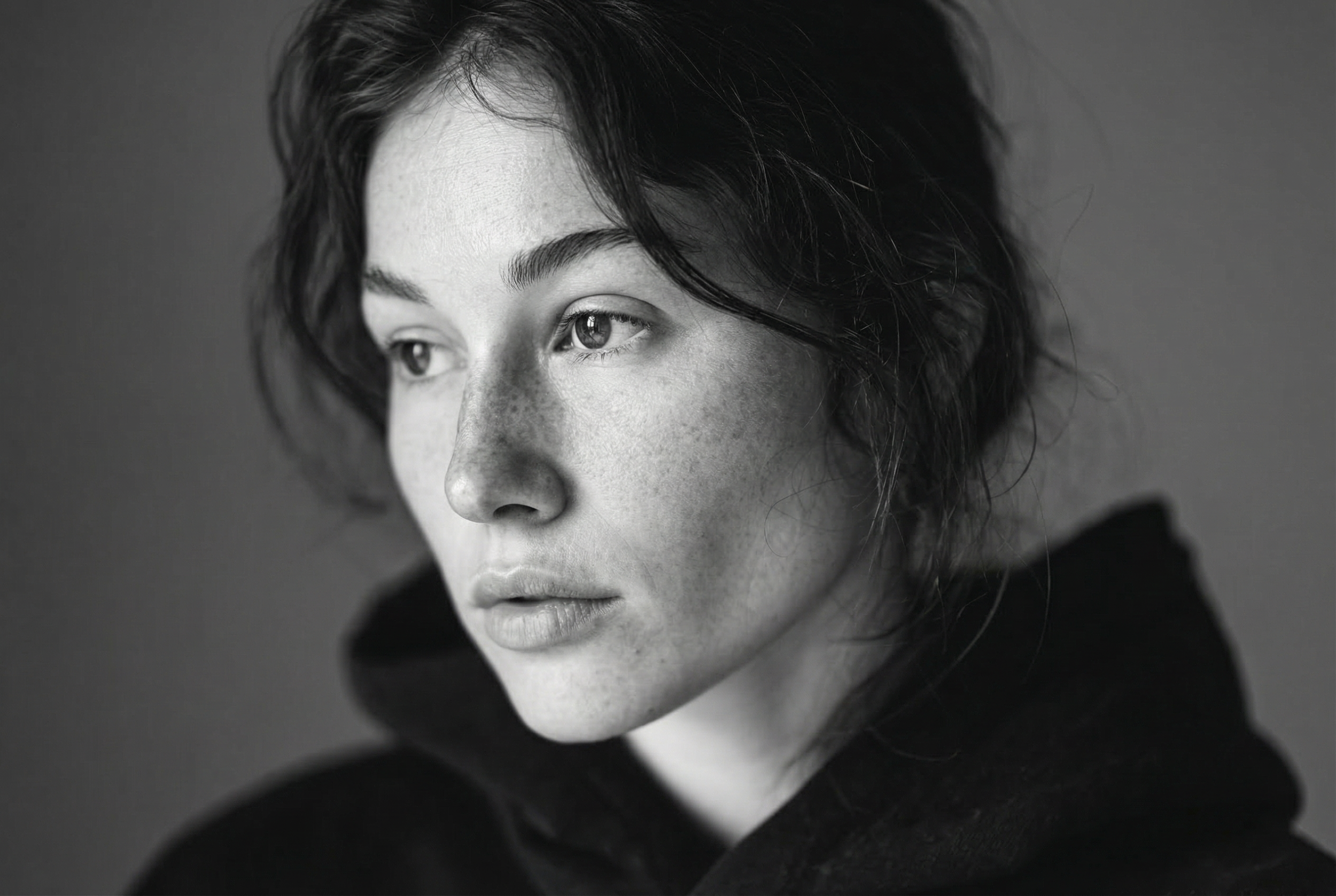
Why Most AI Visuals Feel Dead
Most AI visuals aren’t bad.
They’re sharp, clean, technically correct.
And still lifeless.
What people call “bad AI images” usually aren’t failures of realism or quality. They fail because nothing is at stake. There’s no tension, no friction, no visible decision behind them.
The result isn’t ugly.
It’s empty.
What “Dead” Actually Means
A dead image doesn’t offend.
It doesn’t confuse.
It doesn’t demand anything.
It feels finished the moment you see it.
Dead doesn’t mean low quality. Dead means neutral. It means every edge has been softened, every risk removed, every possibility averaged down until nothing resists the viewer.
Nothing pushes back.
Nothing lingers.
The Default AI Look
Most AI visuals share the same DNA:
Centered subjects.
Balanced lighting.
Clean composition.
Polite expressions.
This isn’t an accident. AI models optimize for approval. They learn from what gets accepted, liked, and validated most often. Extremes disappear. Friction gets smoothed out. The average wins.
The image looks “professional.”
It also looks like everything else.
Why Brands Keep Approving It
Because it feels safe.
Clean images move quickly through approval chains. Nobody has to defend them. Nobody has to explain why something feels strange, unresolved, or uncomfortable.
Speed replaces responsibility.
Approval replaces intention.
The image gets approved — not because it’s strong, but because it doesn’t create friction. And friction is exactly what most organizations are trained to avoid.
What’s Missing
What’s missing is not better prompts or better tools.
What’s missing is exclusion.
Life enters an image the moment something is deliberately removed. When a choice is made that closes other doors. When an image commits to one feeling and sacrifices others.
Dead images include everything.
Alive images protect something.
Direction vs Optimization
AI optimizes by default. It searches for the most acceptable version of an idea.
Direction does the opposite. Direction resists optimization. It keeps tension alive by refusing to resolve everything. It allows imbalance, ambiguity, and discomfort to remain.
Optimization smooths.
Direction holds.
That difference is visible — immediately — in the final image.
What Alive Images Do Differently
Alive images don’t try to please.
They don’t explain themselves fully.
They feel slightly unresolved.
They ask something of the viewer instead of delivering everything upfront. You sense a decision behind them — even if you can’t articulate it.
That’s not a technical quality.
That’s authorship.
Closing
AI didn’t kill visual culture.
It exposed weak decisions.
Dead images don’t come from technology.
They come from indecision.


